Chapter 8 Adjacent plots
Adding adjacent plots to the heatmap is easy with superheat using the yt (‘y top’) and yr (‘y right’). yr and yt must have the same length as either:
the number of rows/columns, or
the number of row clusters/column clusters (for scatterplots, barplots, and boxplots only).
The plot types available for the adjacent plots are
scatter: scatterplot (default)line: line plotsmooth: smoothed linescattersmooth: scatterplot with smoothed linescatterline: scatterplot with connecting linesbar: barplotboxplot: boxplot (with clusters)
The plot type can be specified using yt.plot.type = 'line', for example.
8.1 Scatterplots
The following example adds the miles per gallon (mpg) variable as a scatterplot next to the rows, and then orders the rows by the mpg variable. The yr argument takes a vector to plot next to the rows, while the yt argument takes a vector to plot next to the columns.
# plot a super heatmap
superheat(dplyr::select(mtcars, -mpg),
          # scale the variables/columns
          scale = T,

          # add mpg as a scatterplot next to the rows
          yr = mtcars$mpg,
          yr.axis.name = "miles per gallon")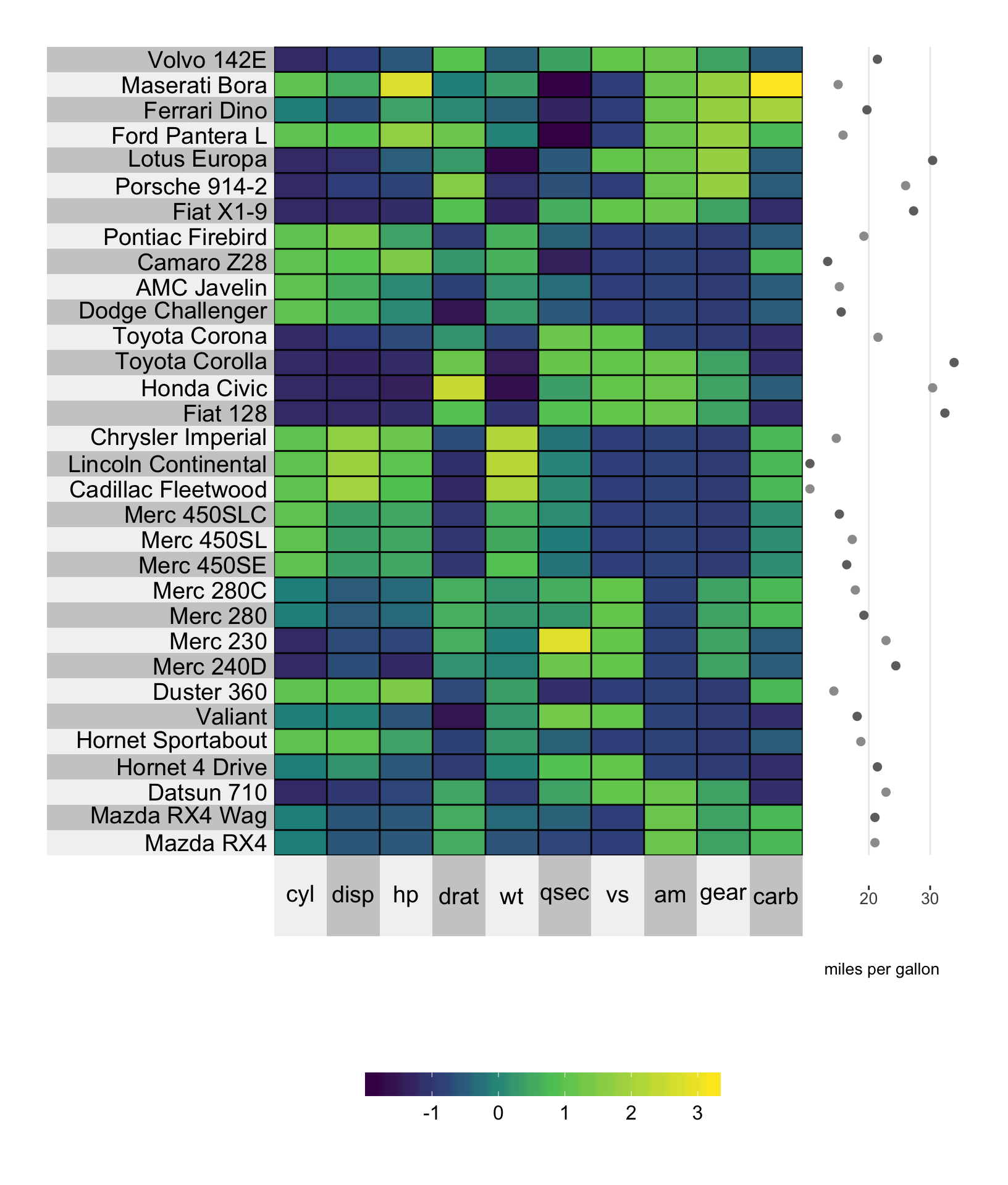
8.1.1 Size
You can change the size of the scatterplot points using the yr.point.size or yt.point.size arguments.
# plot a super heatmap
superheat(dplyr::select(mtcars, -mpg),
          # scale the variables/columns
          scale = T,

          # add mpg as a scatterplot next to the rows
          yr = mtcars$mpg,
          yr.axis.name = "miles per gallon",
          yr.point.size = 4)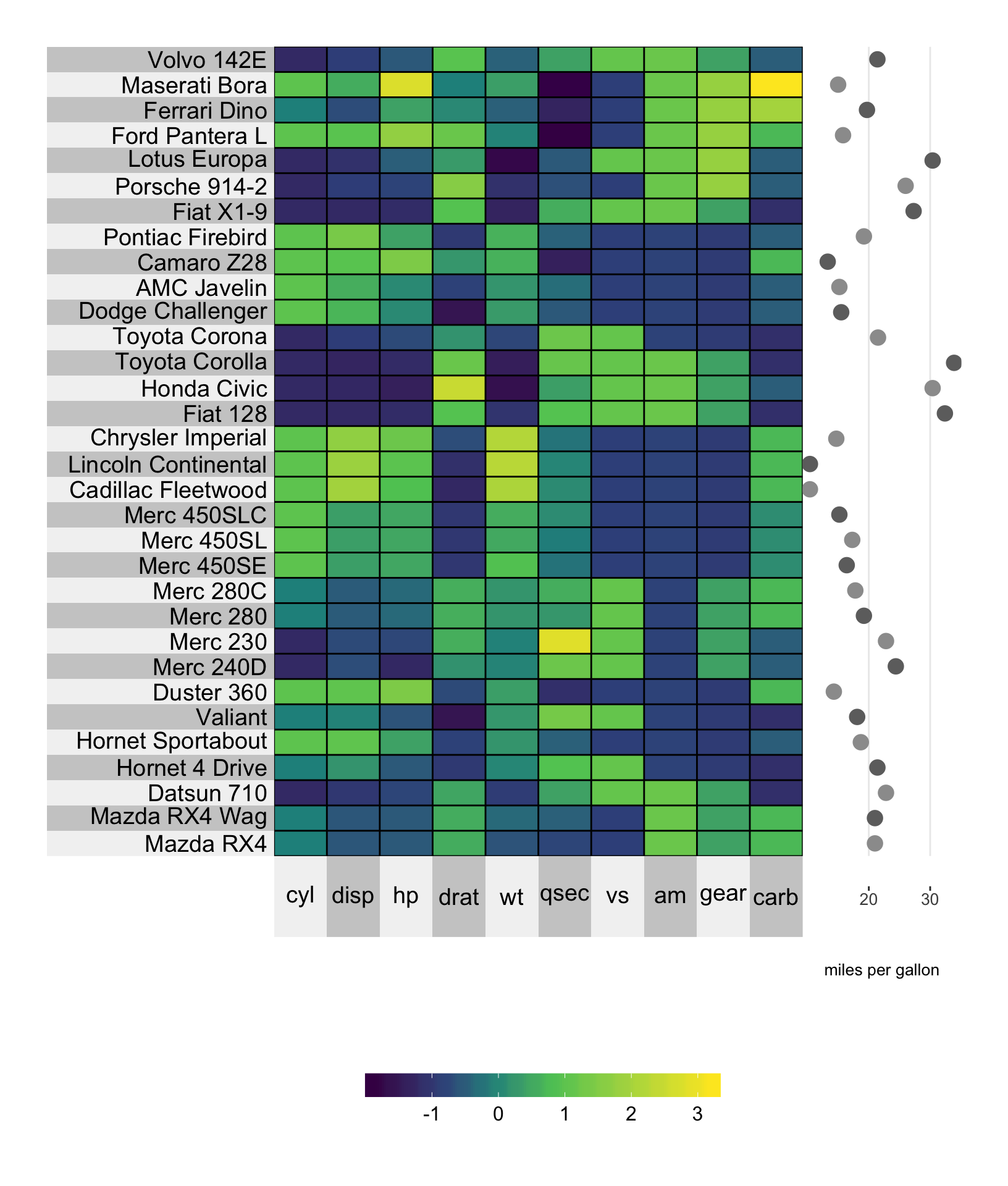
8.1.2 Color
Changing the color of the points in the scatterplot can be achieved using the yr.obs.col and yt.obs.col arguments, which are designed for specifying the color of individual data points.
For example, in the plot below, we are setting the fifth data point to be red, while the rest are grey. Note that the “fifth” data point corresponds to the fifth data point in the original matrix \(X\), rather than the re-ordered matrix (recall that the default order corresponds to a hierarchical clustering. To remove this ordering, specify pretty.order.rows = FALSE).
# set a color vector
point.col <- rep("wheat3", nrow(mtcars))
point.col[5] <- "red"

# plot a super heatmap
superheat(dplyr::select(mtcars, -mpg),
          # scale the variables/columns
          scale = T,

          # add mpg as a scatterplot next to the rows
          yr = mtcars$mpg,
          yr.axis.name = "miles per gallon",
          # change the color of the points
          yr.obs.col = point.col,
          yr.point.size = 4)
8.1.3 Clustering
If we cluster the cars into three groups based on the number of gears, then we can provide a yr whose length is either equal to nrow(X) or is equal to the number of clusters (length(membership.rows)), which in this case is equal to 3.
If yr has length equal to nrow(X) then we can specify the point colors using yr.obs.col as above.
# plot a super heatmap
superheat(dplyr::select(mtcars, -mpg, -gear),
          # scale the variables/columns
          scale = T,

          # cluster the rows
          membership.rows = paste(mtcars$gear, "gears"),
          left.label = "variable",

          # add mpg as a scatterplot next to the rows
          yr = mtcars$mpg,
          yr.axis.name = "miles per gallon",
          yr.obs.col = rep("paleturquoise4", nrow(mtcars)),
          yr.point.size = 4)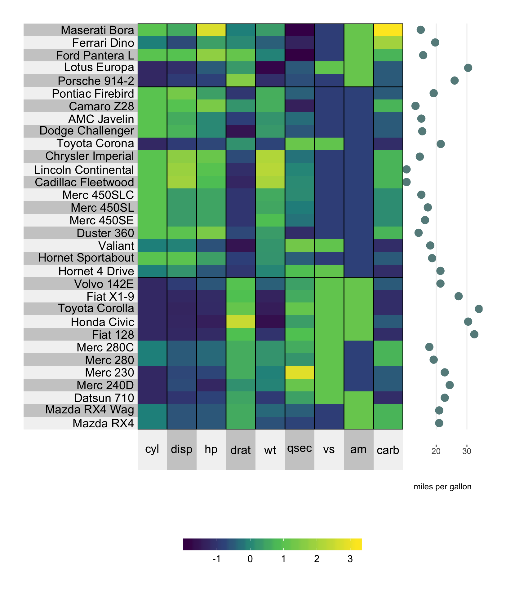
Setting the color for each cluster can be achieved using the yr.cluster.col/yt.cluster.col arguments.
# plot a super heatmap
superheat(dplyr::select(mtcars, -mpg, -gear),
          # scale the variables/columns
          scale = T,

          # cluster the rows
          membership.rows = paste(mtcars$gear, "gears"),
          left.label = "variable",

          # add mpg as a scatterplot next to the rows
          yr = mtcars$mpg,
          yr.axis.name = "miles per gallon",
          yr.cluster.col = c("turquoise4", "plum4", "springgreen4"),
          yr.point.size = 4)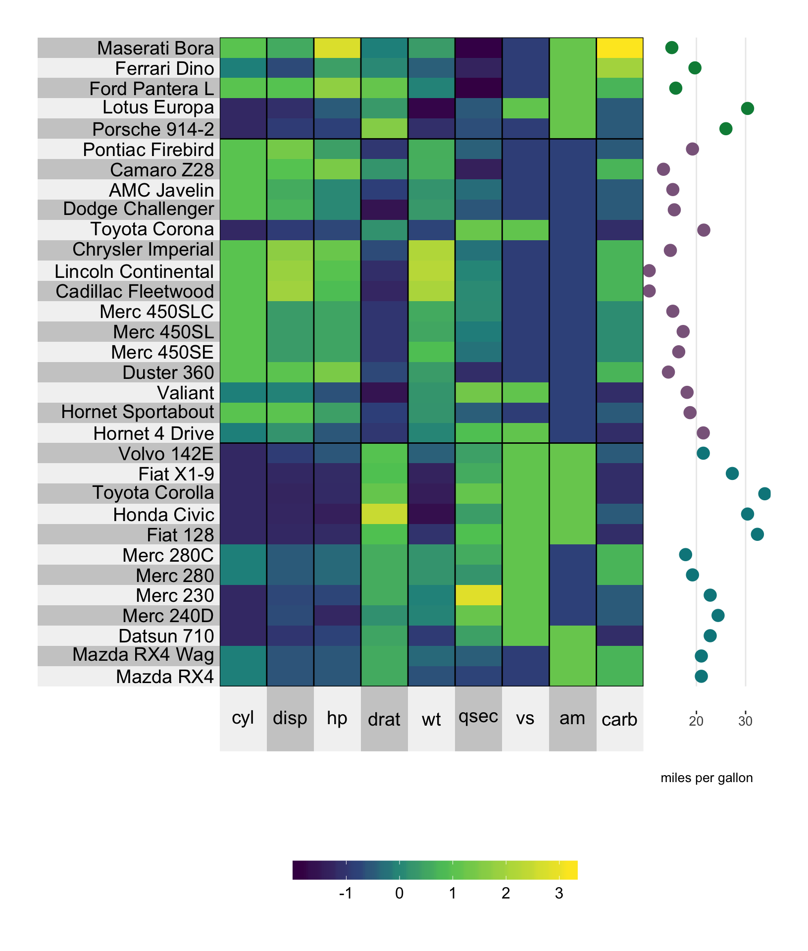
If yr has length equal to the number of clusters (which in this case would correspond to a vector of length three), then the three points are placed next to each cluster and yr.cluster.col/yt.cluster.col should be used to define the color for the points at the cluster-level.
# average the miles per gallon in each gear cluster
library(dplyr)
mpg.per.cluster <- mtcars %>%
  group_by(gear) %>%
  summarize(mpg.avg = mean(mpg)) %>%
  select(mpg.avg) %>%
  unlist

# plot a super heatmap
superheat(dplyr::select(mtcars, -mpg, -gear),
          # scale the variables/columns
          scale = T,

          # cluster the rows
          membership.rows = paste(mtcars$gear, "gears"),
          left.label = "variable",

          # add mpg as a scatterplot next to the rows
          yr = mpg.per.cluster,
          yr.axis.name = "miles per gallon",
          yr.cluster.col = c("black", "red", "orange"),
          yr.point.size = 4)
8.2 Line plot
The line plot is a nice way of depicting a trend. Instead of plotting each data unit as a point connects the points via a continuous line. In the example below, we are plotting the miles per gallon as a line plot, and simultaneously ordering the rows by miles per gallon.
# plot a super heatmap
superheat(dplyr::select(mtcars, -mpg),
          # scale the variables/columns
          scale = T,

          # add mpg as a line plot next to the rows
          yr = mtcars$mpg,
          yr.axis.name = "miles per gallon",
          yr.plot.type = "line",
          # order the rows by mpg
          order.rows = order(mtcars$mpg))
8.2.1 Size
The yr.line.size/yt.line.size arguments determine the thickness of the line plot.
# plot a super heatmap
superheat(dplyr::select(mtcars, -mpg),
          # scale the variables/columns
          scale = T,

          # add mpg as a line plot next to the rows
          yr = mtcars$mpg,
          yr.axis.name = "miles per gallon",
          yr.plot.type = "line",
          # change the line thickness
          yr.line.size = 4,
          # order the rows by mpg
          order.rows = order(mtcars$mpg))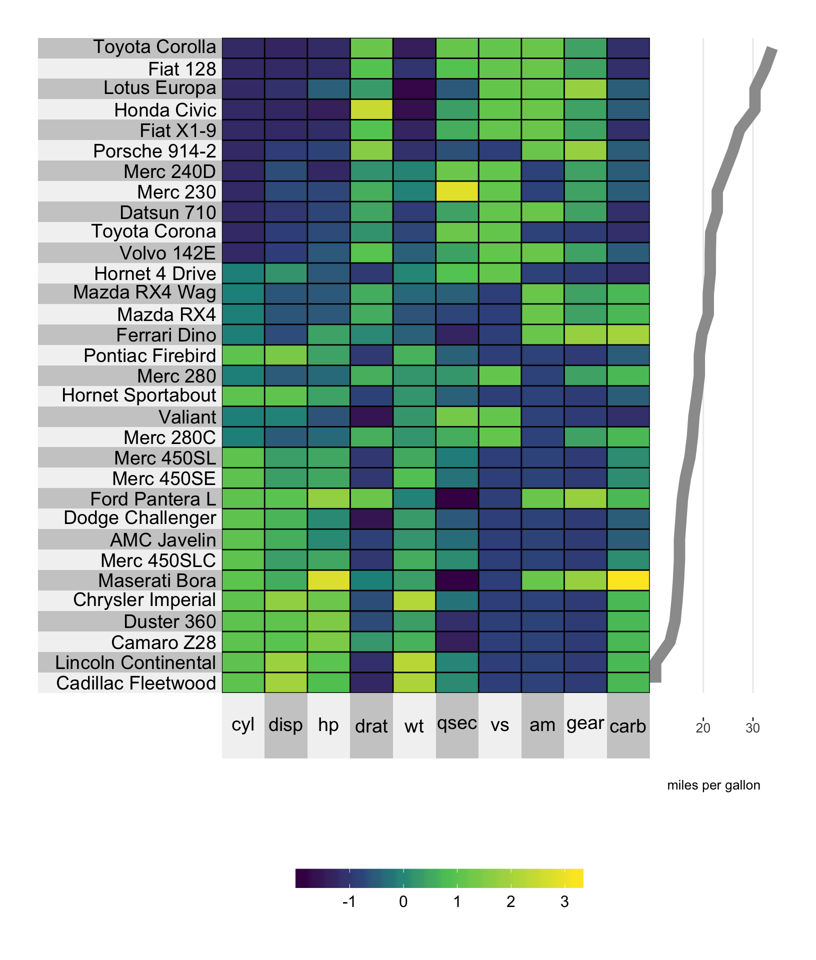
8.2.2 Color
The color can be changed using the yr.line.col/yt.line.col arguments.
# plot a super heatmap
superheat(dplyr::select(mtcars, -mpg),
          # scale the variables/columns
          scale = T,

          # add mpg as a line plot next to the rows
          yr = mtcars$mpg,
          yr.axis.name = "miles per gallon",
          yr.plot.type = "line",
          # change the line thickness
          yr.line.size = 4,
          # change the line color
          yr.line.col = "springgreen4",
          # order the rows by mpg
          order.rows = order(mtcars$mpg))
8.2.3 Clustering
When clustering, the line will be grouped by cluster and the cluster-wise color can be set using yr.clust.col/yt.clust.col (rather than yr.line.col etc). Note that you cannot have aggregated line plots at the cluster level, implying that yr and yt must have the same length as nrow(X) and ncol(X).
# plot a super heatmap
superheat(dplyr::select(mtcars, -mpg),
          # scale the variables/columns
          scale = T,

          # cluster the rows
          membership.rows = paste(mtcars$gear, "gears"),
          left.label = "variable",

          # add mpg as a line plot next to the rows
          yr = mtcars$mpg,
          yr.axis.name = "miles per gallon",
          yr.plot.type = "line",
          # change the line thickness
          yr.line.size = 4,
          # change the line color
          yr.cluster.col = c("plum4", "paleturquoise4", "salmon3"),
          # order the rows by mpg
          order.rows = order(mtcars$mpg))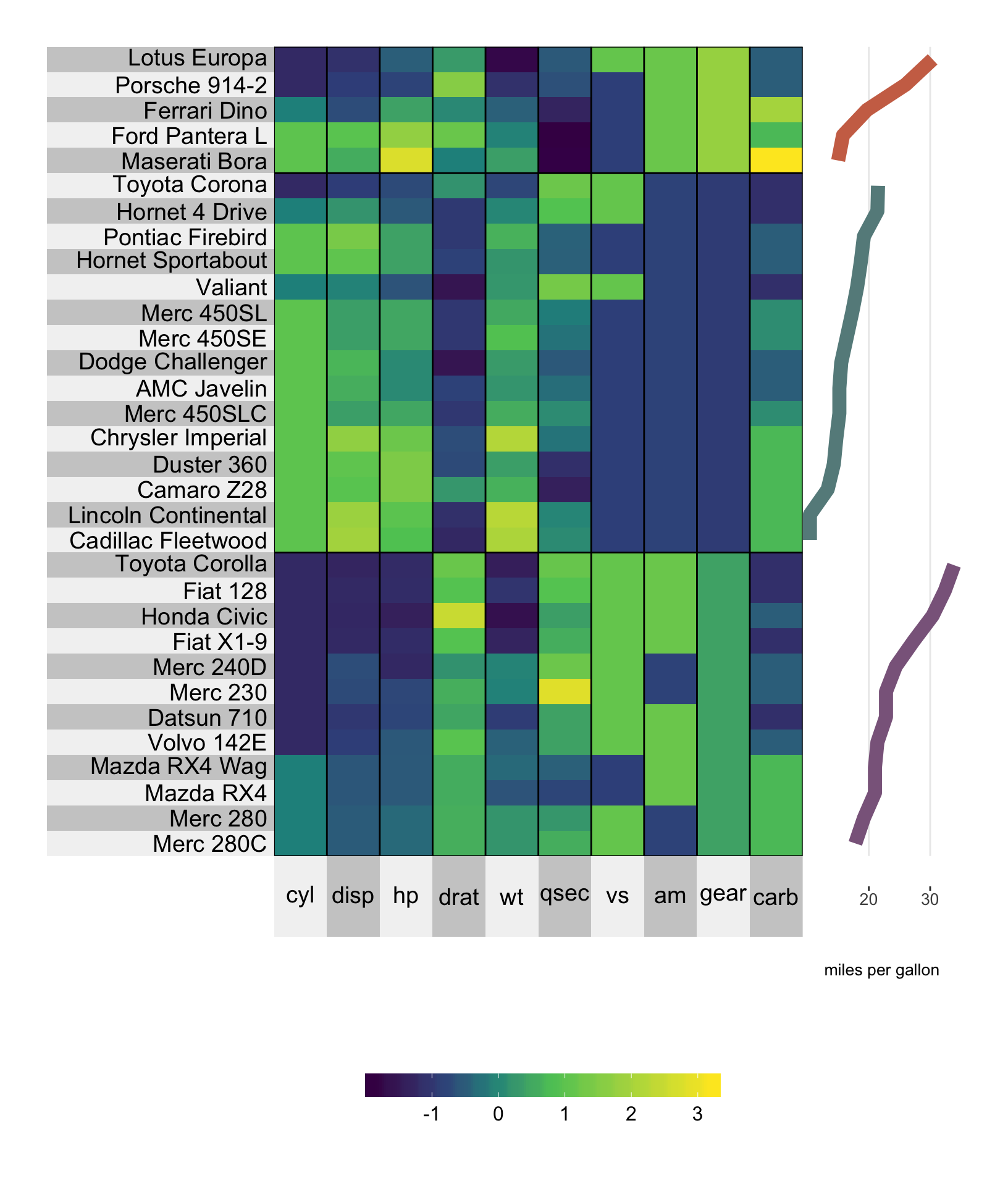
8.3 Smoothed line
The options for a smoothed line are much line those for the line plot above. Setting yt.plot.type/yr.plot.type to "smooth" will provide a loess smoothed line (default) or linear regression line based (set smoothing.method = "lm"). Color can be specified using yr.line.col/yt.line.col.
8.3.1 Loess curve
In the example below we produce a loess smoothed curve for miles per gallon versus number of cylinders (order.rows = order(mtcars$cyl)). The standard error shading can be removed by specifying smooth.se = FALSE.
# plot a super heatmap
superheat(dplyr::select(mtcars, -mpg),
          # scale the variables/columns
          scale = T,

          # add mpg as a smoothed line plot next to the rows
          yr = mtcars$mpg,
          yr.axis.name = "miles per gallon",
          yr.plot.type = "smooth",
          # change the line thickness and color
          yr.line.size = 4,
          yr.line.col = "red4",
          # order the rows by mpg
          order.rows = order(mtcars$cyl))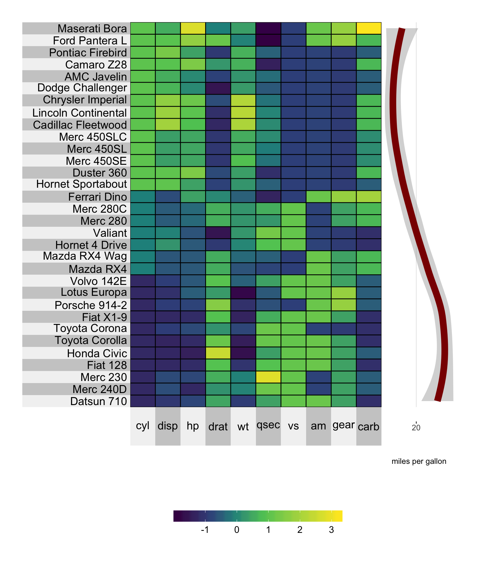
8.3.2 Linear regression line
A linear regression of miles per gallon versus number of cylinders (order.rows = order(mtcars$cyl)) is specified similarly with the additional argument smoothing.method = "lm".
Again, the standard error shading can be removed by specifying smooth.se = FALSE.
# plot a super heatmap
superheat(dplyr::select(mtcars, -mpg),
          # scale the variables/columns
          scale = T,

          # add mpg as a smoothed line plot  next to the rows
          yr = mtcars$mpg,
          yr.axis.name = "miles per gallon",
          yr.plot.type = "smooth",
          smoothing.method = "lm",
          # change the line thickness and color
          yr.line.size = 4,
          yr.line.col = "plum4",
          # order the rows by mpg
          order.rows = order(mtcars$cyl))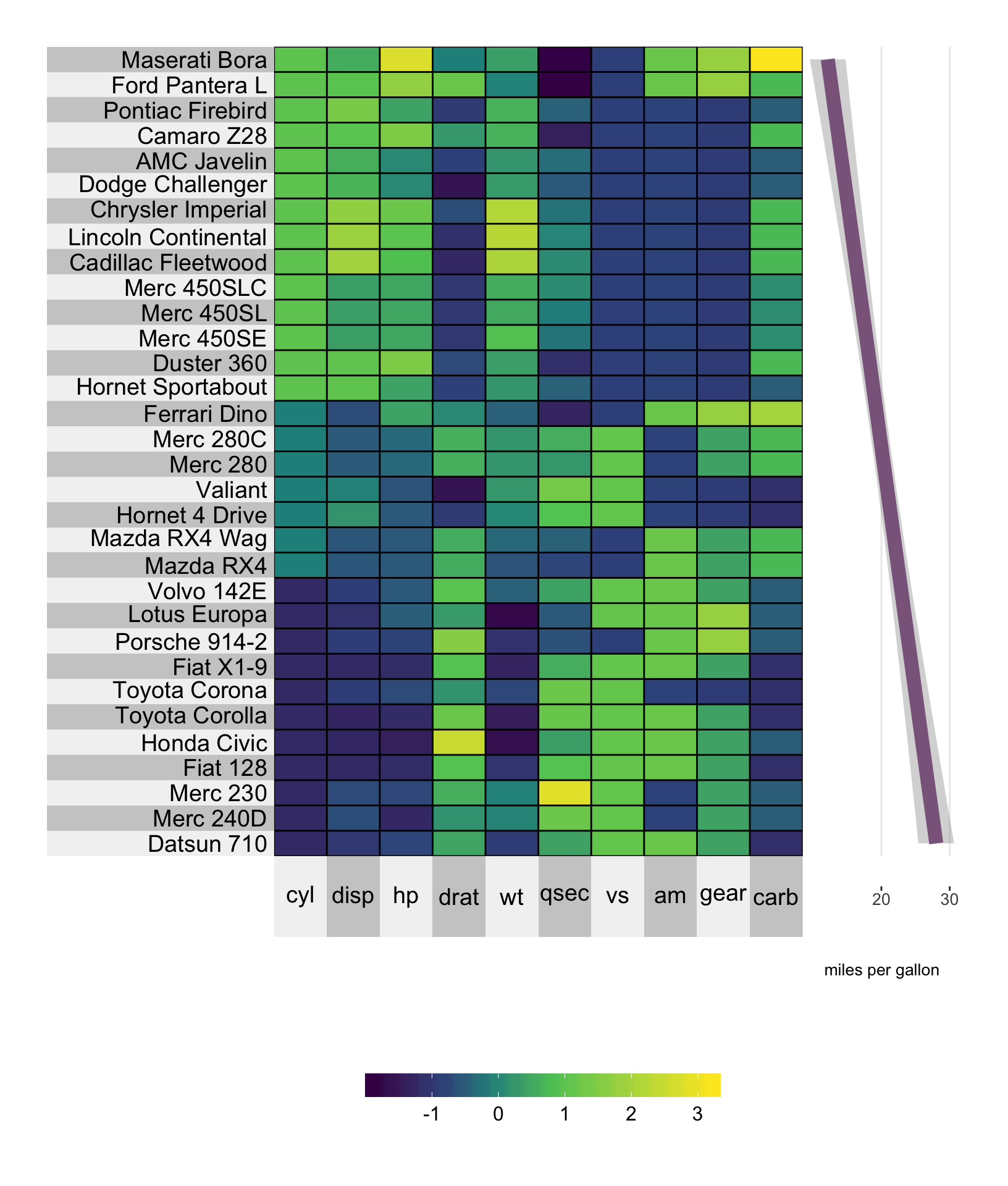
8.4 Scatterplot with connecting line plot
The scatterline plot combines the line plot and the scatter plot. The arguments that can be used separately for the line plot and the scatterplot can be used for the scatterline plot.
# plot a super heatmap
superheat(dplyr::select(mtcars, -mpg),
          # scale the variables/columns
          scale = T,

          # add mpg as a scatter line plot next to the rows
          yr = mtcars$mpg,
          yr.axis.name = "miles per gallon",
          yr.plot.type = "scatterline",
          # change the line color
          yr.line.col = "tomato3",
          yr.obs.col = rep("orange", nrow(mtcars)),
          yr.point.size = 4,
          # order the rows by mpg
          order.rows = order(mtcars$cyl))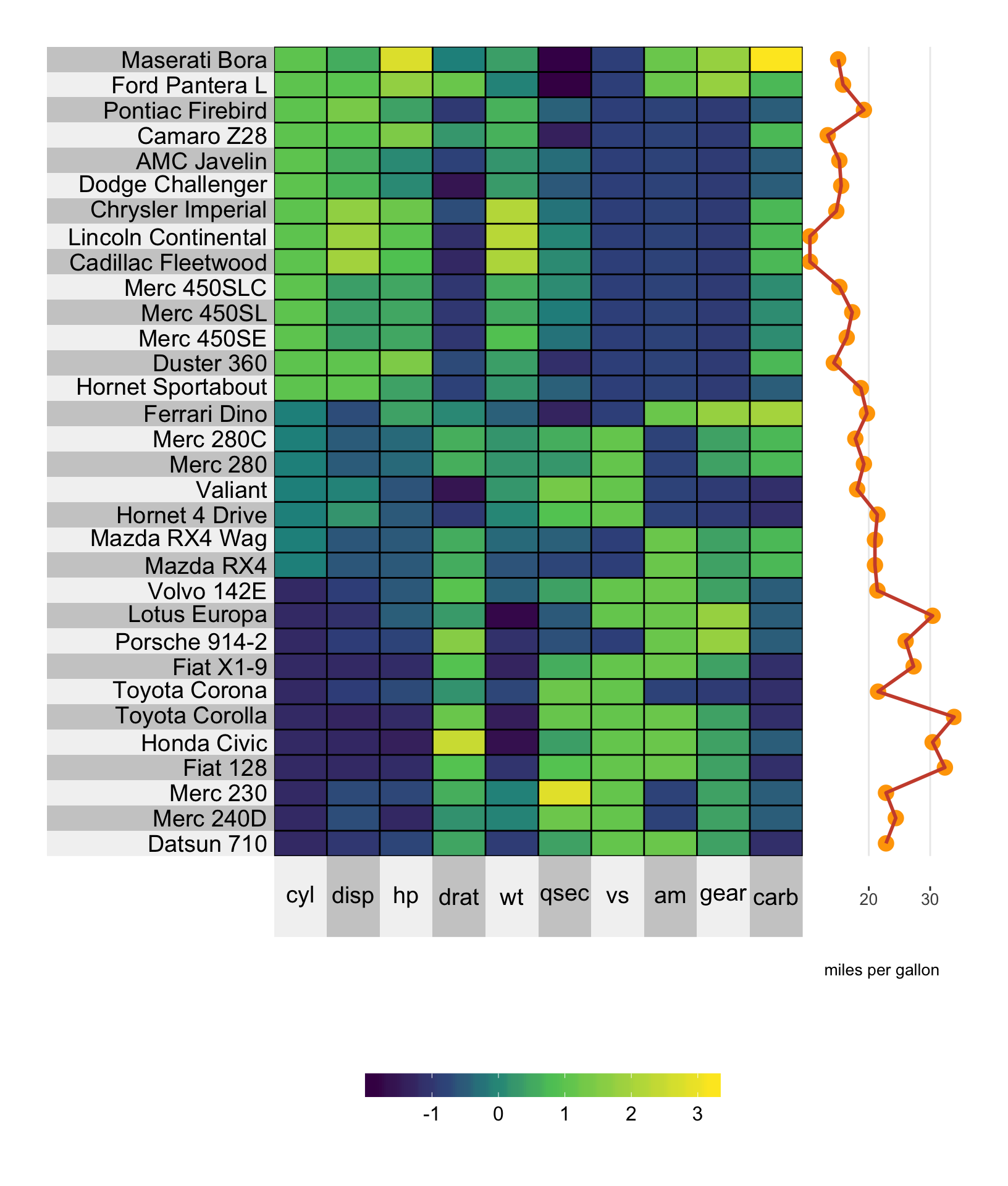
8.5 Scatterplot with smoothed line
The scattersmooth plot combines the functionality of the scatter plot with the smoothed curve. The aesthetic arguments that apply for the scatterplot and the smoothed curve apply for the scattersmooth plot too.
# plot a super heatmap
superheat(dplyr::select(mtcars, -mpg),
          # scale the variables/columns
          scale = T,

          # add mpg as a scatter smoothed plot next to the rows
          yr = mtcars$mpg,
          yr.axis.name = "miles per gallon",
          yr.plot.type = "scattersmooth",
          # change the line color
          yr.line.col = "tomato3",
          yr.obs.col = rep("orange", nrow(mtcars)),
          # order the rows by mpg
          order.rows = order(mtcars$cyl))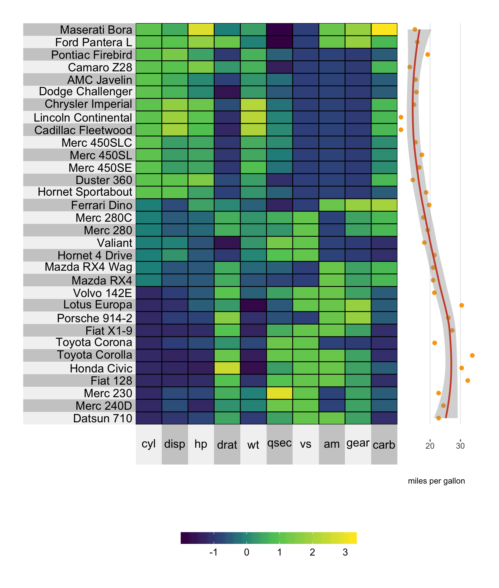
8.6 Barplot
Barplots are a particularly nice way of presenting and comparing values of a variable. Adding a barplot next to the columns and/or rows can be achieved by setting yr.plot.type = "bar" or yt.plot.type = "bar".
# plot a super heatmap
superheat(dplyr::select(mtcars, -mpg),
          # scale the variables/columns
          scale = T,

          # add mpg as a barplot next to the rows
          yr = mtcars$mpg,
          yr.axis.name = "miles per gallon",
          yr.plot.type = "bar")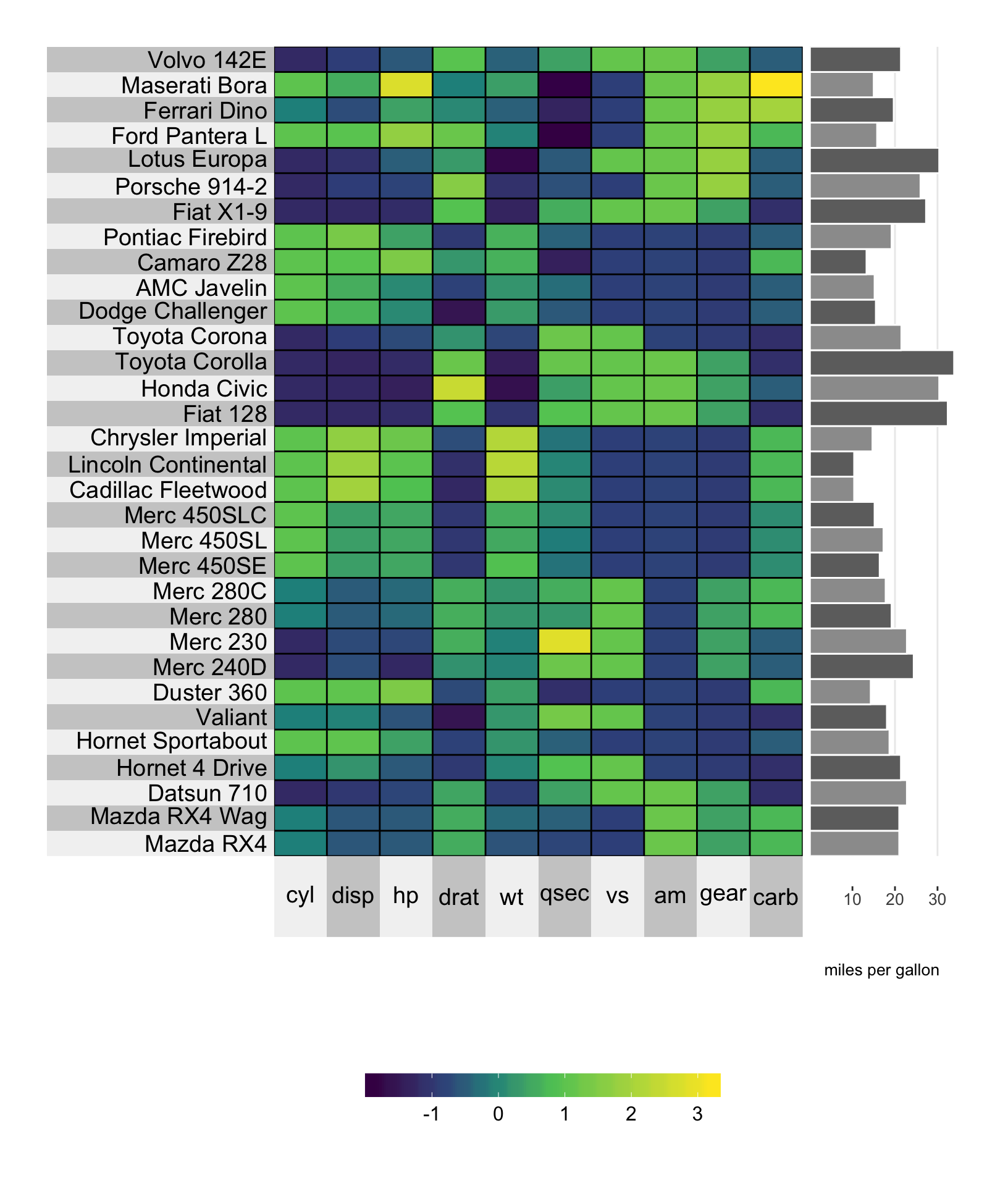
8.6.1 Color
The bar fill color can be set using the standard yr.obs.col/yt.obs.col arguments. The outline of each bar can be set using the yr.bar.col/yr.bar.col arguments.
# plot a super heatmap
superheat(dplyr::select(mtcars, -mpg),
          # scale the variables/columns
          scale = T,

          # add mpg as a barplot next to the rows
          yr = mtcars$mpg,
          yr.axis.name = "miles per gallon",
          yr.plot.type = "bar",
          # set bar colors
          yr.bar.col = "black",
          yr.obs.col = rep("beige", nrow(mtcars)))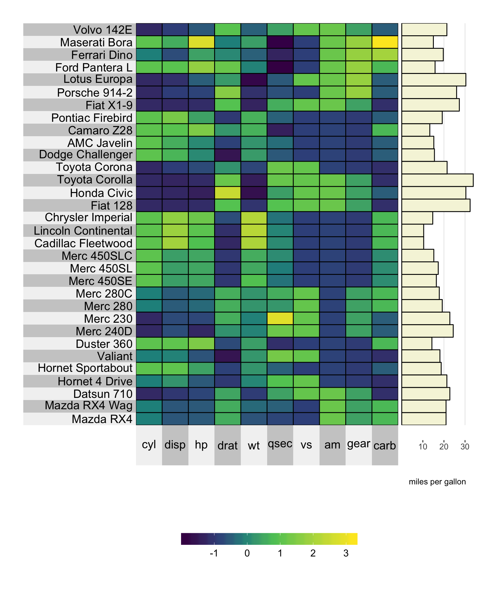
8.6.2 Clustering
Bar plots can present values aggregated across clusters. In this situation, as with the other plots, the fill color of the bars is set using the yr.cluster.col/yt.cluster.col arguments (instead of the yr.obs.col/yt.obs.col arguments for the unclustered heatmap).
library(dplyr)
mpg.per.cluster <- mtcars %>%
  group_by(gear) %>%
  summarize(mpg.avg = mean(mpg)) %>%
  select(mpg.avg) %>%
  unlist

# plot a super heatmap
superheat(dplyr::select(mtcars, -mpg, -gear),
          # scale the variables/columns
          scale = T,

          # cluster the rows
          membership.rows = paste(mtcars$gear, "gears"),
          left.label = "variable",

          # add mpg per cluster as a barplot
          yr = mpg.per.cluster,
          yr.axis.name = "miles per gallon",
          yr.plot.type = "bar",
          # set bar colors
          yr.bar.col = "black",
          yr.cluster.col = c("beige", "white", "beige"))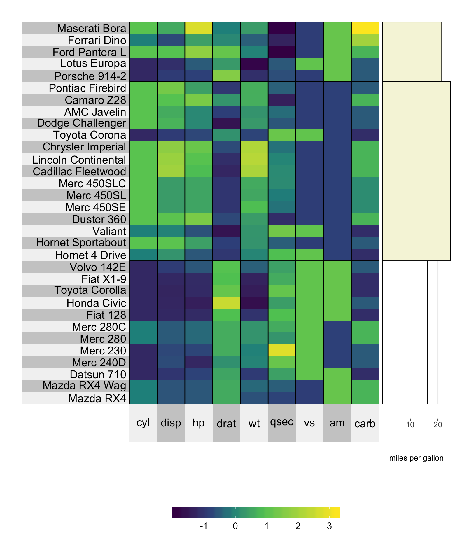
8.7 Boxplot
Boxplots are a bit different to the other plot types presented above. In particular, they can only be used on clustered matrices. The reason for this is that a boxplot must consist of many data points.
library(dplyr)
mpg.per.cluster <- mtcars %>%
  group_by(gear) %>%
  summarize(mpg.avg = mean(mpg)) %>%
  select(mpg.avg) %>%
  unlist

# plot a super heatmap
superheat(dplyr::select(mtcars, -mpg, -gear),
          # scale the variables/columns
          scale = T,

          # cluster the rows
          membership.rows = paste(mtcars$gear, "gears"),
          left.label = "variable",

          # add mpg per cluster as a boxplot
          yr = mtcars$mpg,
          yr.axis.name = "miles per gallon",
          yr.plot.type = "boxplot")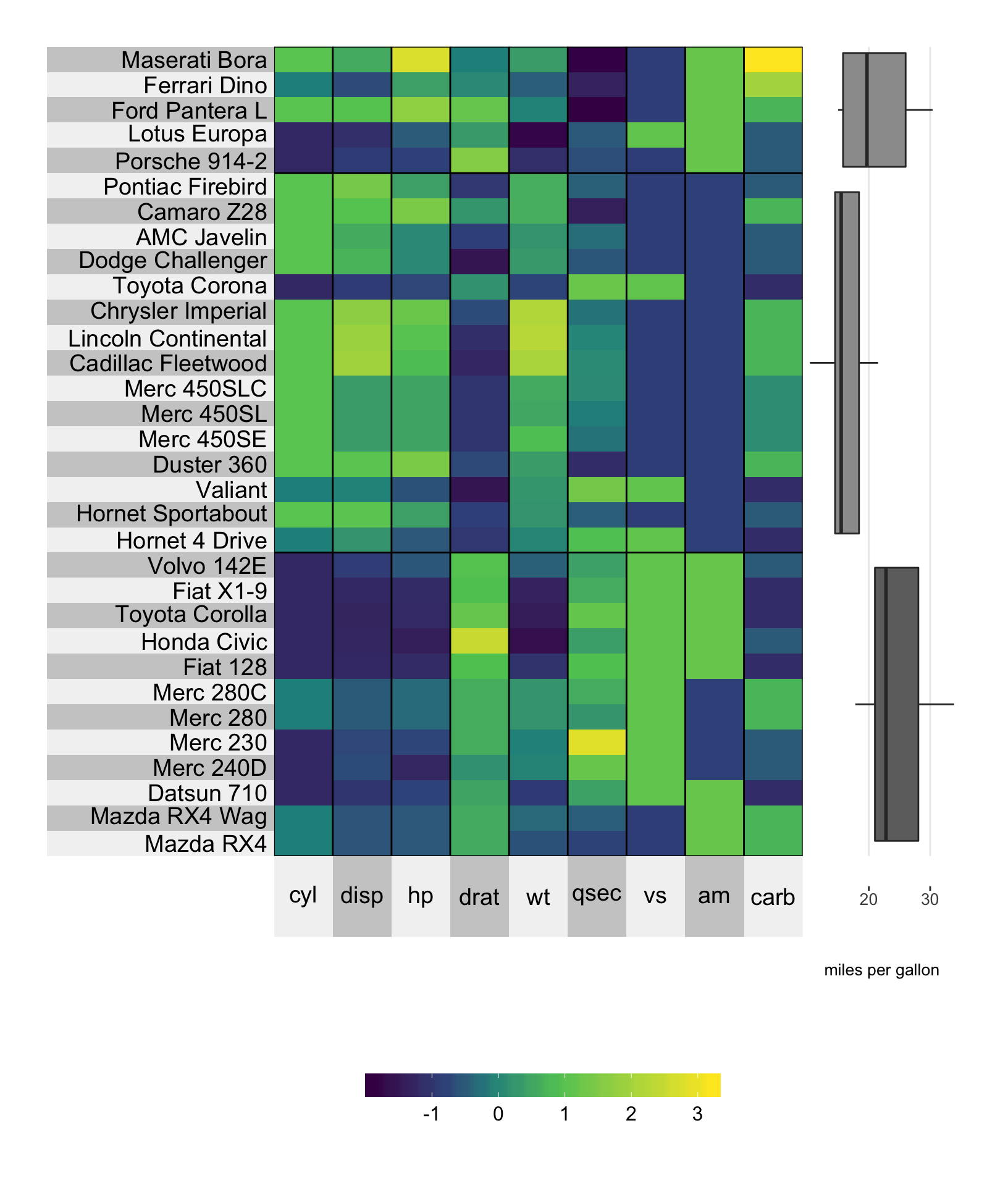
8.7.1 Color
Setting the color can be achieved using the yr.cluster.col/yt.cluster.col arguments.
library(dplyr)
mpg.per.cluster <- mtcars %>%
  group_by(gear) %>%
  summarize(mpg.avg = mean(mpg)) %>%
  select(mpg.avg) %>%
  unlist

# plot a super heatmap
superheat(dplyr::select(mtcars, -mpg, -gear),
          # scale the variables/columns
          scale = T,

          # cluster the rows
          membership.rows = paste(mtcars$gear, "gears"),
          left.label = "variable",

          # add mpg per cluster as a boxplot
          yr = mtcars$mpg,
          yr.axis.name = "miles per gallon",
          yr.plot.type = "boxplot",
          yr.cluster.col = c("beige", "slategray1", "beige"))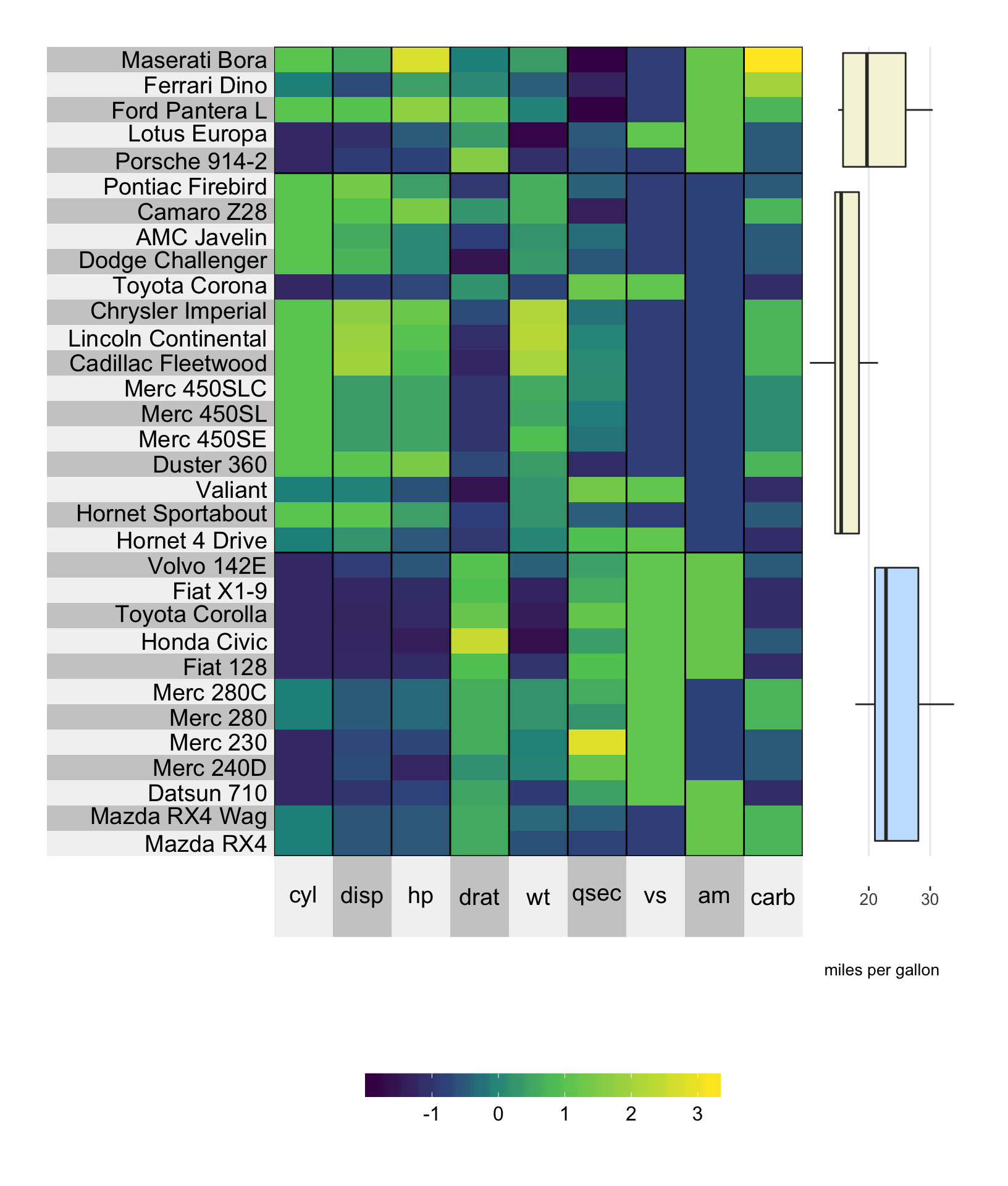
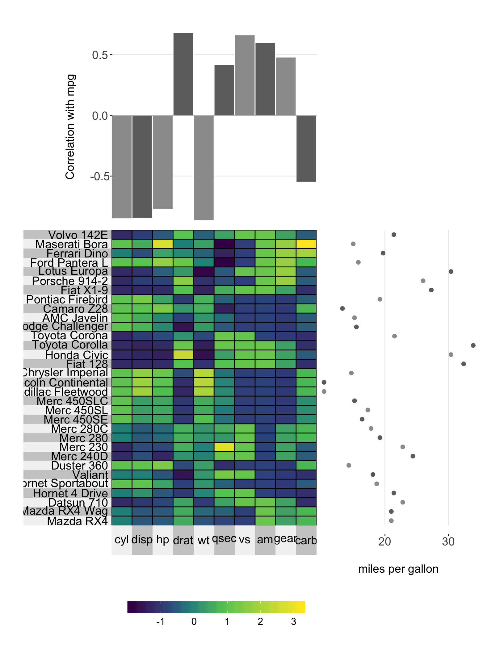
8.8 Axis options
8.8.1 Name
The axis name can be specified using yr.axis.name/yt.axis.name.
# plot a super heatmap
superheat(dplyr::select(mtcars, -mpg),
          # scale the variables/columns
          scale = T,

          # add mpg as a scatterplot next to the rows
          yr = mtcars$mpg,
          yr.axis.name = "miles per gallon",

          # add correlation between each variable and miles per gallon
          yt = cor(mtcars)[-1,"mpg"],
          yt.plot.type = "bar",
          yt.axis.name = "Correlation\nwith mpg")
8.8.2 Size
The size of the axis name can be set using yr.axis.name.size/yt.axis.name.size, while the size of the axis numbers can be set using yr.axis.size/yt.axis.size.
# plot a super heatmap
superheat(dplyr::select(mtcars, -mpg),
          # scale the variables/columns
          scale = T,

          # add mpg as a scatterplot next to the rows
          yr = mtcars$mpg,
          yr.axis.name = "miles per gallon",

          # add correlation between each variable and miles per gallon
          yt = cor(mtcars)[-1,"mpg"],
          yt.plot.type = "bar",
          yt.axis.name = "Correlation\nwith mpg",
          yt.axis.size = 14,
          yt.axis.name.size = 14)
8.8.3 Limits
You can set the y-axis limits by using the yr.lim and yt.lim arguments. You must provide a vector of length 2 specifying the minimum and maximum values for the range respectively.
# plot a super heatmap
superheat(dplyr::select(mtcars, -mpg),
          # scale the variables/columns
          scale = T,

          # add mpg as a scatterplot next to the rows
          yr = mtcars$mpg,
          yr.axis.name = "miles per gallon",
          yr.lim = c(0, 60),

          # add correlation between each variable and miles per gallon
          yt = cor(mtcars)[-1,"mpg"],
          yt.plot.type = "bar",
          yt.axis.name = "Correlation\nwith mpg",
          yt.lim = c(-1.5, 1))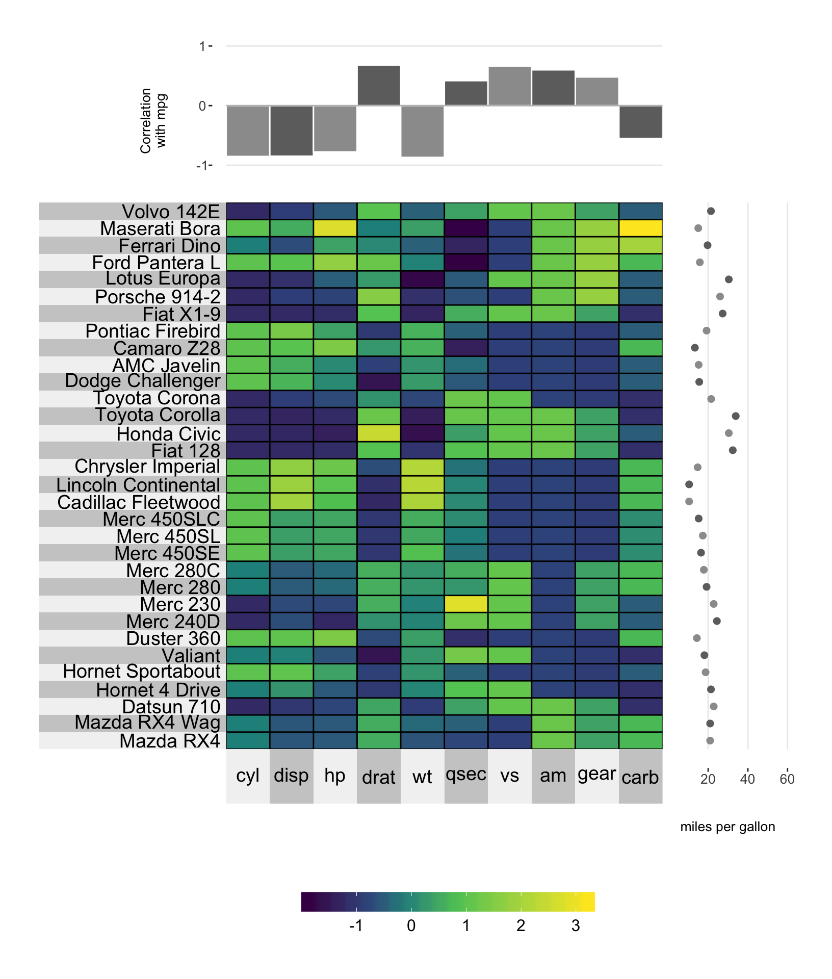
8.8.4 Tick break positions
You can manually set the y-axis tick positions using the yr.breaks and yt.breaks arguments.
# plot a super heatmap
superheat(dplyr::select(mtcars, -mpg),
          # scale the variables/columns
          scale = T,

          # add mpg as a scatterplot next to the rows
          yr = mtcars$mpg,
          yr.axis.name = "miles per gallon",
          yr.lim = c(0, 60),
          yr.breaks = c(10, 40),

          # add correlation between each variable and miles per gallon
          yt = cor(mtcars)[-1,"mpg"],
          yt.plot.type = "bar",
          yt.axis.name = "Correlation\nwith mpg")
You can also change the labels of the y-axis ticks using the yr.break.labels and yt.break.labels arguments.
# plot a super heatmap
superheat(dplyr::select(mtcars, -mpg),
          # scale the variables/columns
          scale = T,

          # add mpg as a scatterplot next to the rows
          yr = mtcars$mpg,
          yr.axis.name = "miles per gallon",
          yr.lim = c(0, 60),
          yr.breaks = c(10, 40),
          yr.break.labels = c("low", "high"),

          # add correlation between each variable and miles per gallon
          yt = cor(mtcars)[-1,"mpg"],
          yt.plot.type = "bar",
          yt.axis.name = "Correlation\nwith mpg")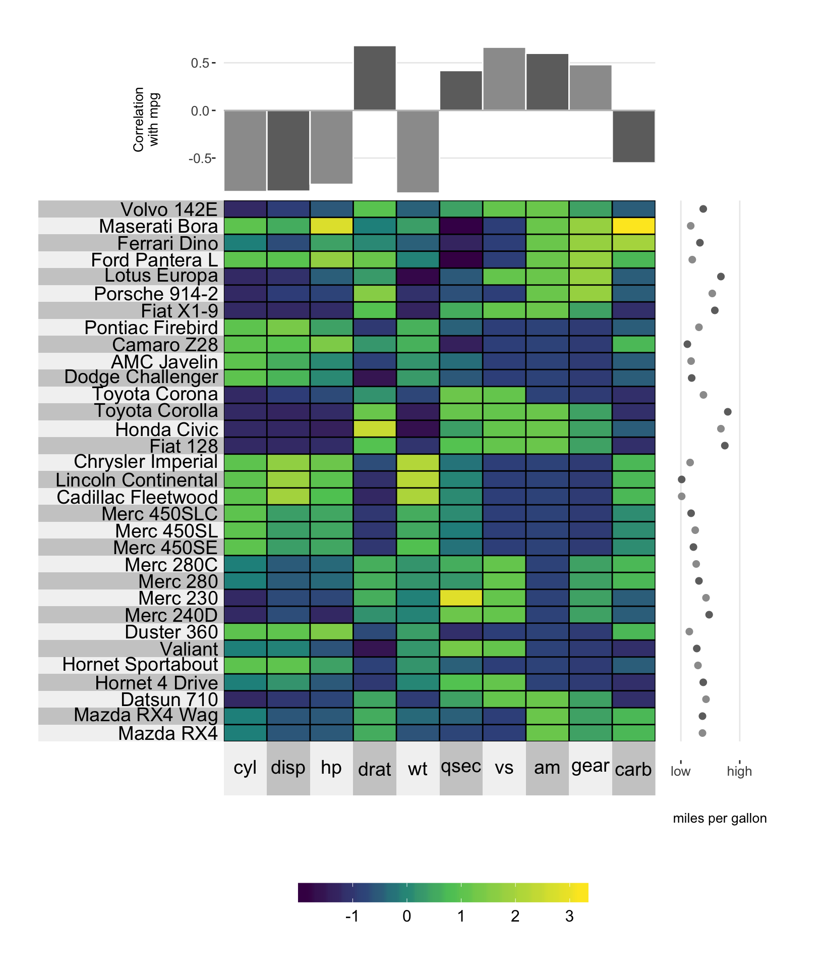
8.9 Plot size
The size of the entire adjacent plot can be determined using the yr.plot.size/yr.plot.size arguments.
# plot a super heatmap
superheat(dplyr::select(mtcars, -mpg),
          # scale the variables/columns
          scale = T,

          # add mpg as a scatterplot next to the rows
          yr = mtcars$mpg,
          yr.axis.name = "miles per gallon",
          yr.axis.size = 14,
          yr.axis.name.size = 14,
          yr.plot.size = 0.8,

          # add correlation between each variable and miles per gallon
          yt = cor(mtcars)[-1,"mpg"],
          yt.plot.type = "bar",
          yt.axis.name = "Correlation with mpg",
          yt.axis.size = 14,
          yt.axis.name.size = 14,
          yt.plot.size = 0.7)