Superheat: a simple example
A simple example of using superheat to create beautiful heatmaps.
Making beautiful and customizable heatmaps just got way easier… Introducing the superheat R package!
Using superheat, it is now extremely easy to produce plots like the example below describing 10 randomly selected cars from the famous mtcars dataset.
library(superheat)
set.seed(1347983)
selected.rows <- sample(1:nrow(mtcars), 10)
X.col <- matrix("black", ncol = ncol(mtcars), nrow = 10)
X.col[scale(mtcars[selected.rows, ]) < 0] <- "white"
superheat(mtcars[selected.rows,],
          # add text
          X.text = round(as.matrix(mtcars[selected.rows, ])),
          X.text.col = X.col,
          # scale columns
          scale = T,
          # label aesthetics
          left.label.size = 0.5,
          bottom.label.size = 0.15,
          bottom.label.text.angle = 90,
          bottom.label.text.alignment = "right",
          bottom.label.col = "white",
          # dendrogram
          row.dendrogram = T,
          # top plot
          yt = sapply(mtcars, function(x) cor(x, mtcars$hp)),
          yt.plot.type = "bar",
          yt.axis.name = "correlation\nwith\nhorsepower",
          # column order
          order.cols = order(sapply(mtcars, function(x) cor(x, mtcars$hp))),
          # grid lines
          grid.vline.col = "white",
          grid.hline.col = "white")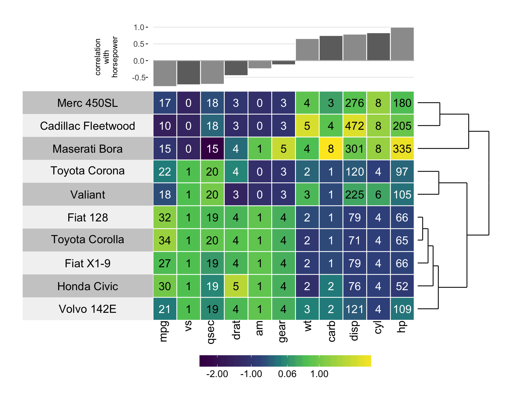
To see more details on what you can do with superheat, see the vignette, as well as our paper outlining case studies using Superheat currently available on arXiv.
Share this post
Twitter
Google+
Facebook
Reddit
LinkedIn
StumbleUpon
Email