Interactive visualization in R
Learn about creating interactive visualizations in R.
Last week I gave an SGSA seminar on interactive visualizations in R.
Here is a long-form version of the talk.
Why be interactive?
Interactivity allows the viewer to engage with your data in ways impossible by static graphs. With an interactive plot, the viewer can zoom into the areas the care about, highlight the data points that are relevant to them and hide the information that isn’t.
Above all of that, making simple interactive plots are a sure-fire way to impress your coworkers!
A word of caution: if the interactivity doesn’t add anything to your visualization, don’t do it.
Examples on the web
Some super cool examples of interactive data viz on the web include:
While these were mostly made using D3, there are certainly ways of making simplified versions of several of these examples directly in R.
Making ggplot2 interactive
If you’re already familiar with ggplot2 and want to stay that way, it is super easy to make your existing ggplot2 visualizations interactive.
ggplot2
A typical ggplot viz looks like this:
library(ggplot2)
g <- ggplot(txhousing, aes(x = date, y = sales, group = city)) +
  geom_line(alpha = 0.4)
g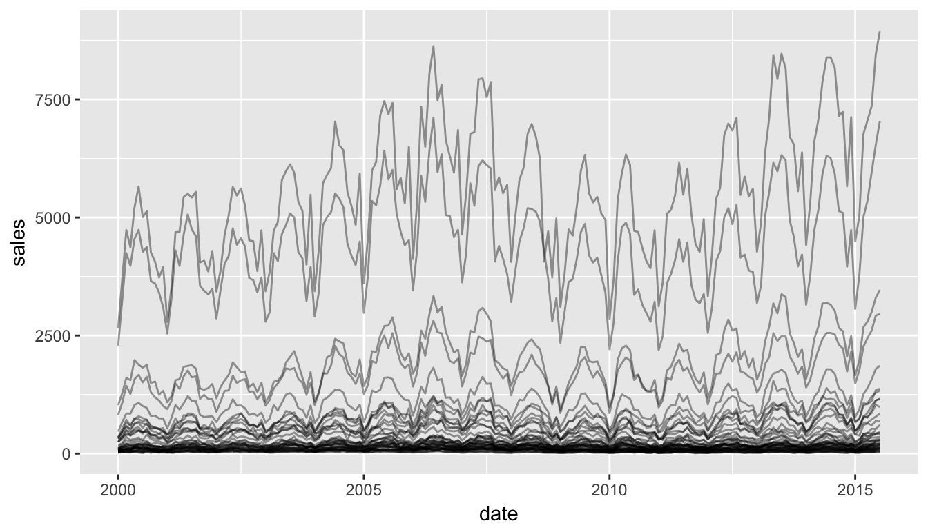
ggplot2 + plotly
Using plotly directly on your ggplot2 graphics makes them interactive!
library(plotly)
g <- ggplot(txhousing, aes(x = date, y = sales, group = city)) +
  geom_line(alpha = 0.4)
ggplotly(g, tooltip = c("city"))
plotly
However, plotly can be used as a stand-alone function (integrated with the magrittr piping syntax rather than the ggplot + syntax), to create some powerful interactive visualizations based on line charts, scatterplots and barcharts.
g <- txhousing %>%
  # group by city
  group_by(city) %>%
  # initiate a plotly object with date on x and median on y
  plot_ly(x = ~date, y = ~median) %>%
  # add a line plot for all texan cities
  add_lines(name = "Texan Cities", hoverinfo = "none",
            type = "scatter", mode = "lines",
            line = list(color = 'rgba(192,192,192,0.4)')) %>%
  # plot separate lines for Dallas and Houston
  add_lines(name = "Houston",
            data = filter(txhousing,
                          city %in% c("Dallas", "Houston")),
            hoverinfo = "city",
            line = list(color = c("red", "blue")),
            color = ~city)
g
plotly: adding a slider
It is also super easy to add a range slider to your visualization.
g %>% rangesliderLinking with Crosstalk
Sometimes you have two plots of the same data and you want to be able to link the data from one plot to the data in the other plot. This, unsurprisingly, is called “linking”, and can be achieved using the crosstalk package.
library(crosstalk)
# define a shared data object
d <- SharedData$new(mtcars)
# make a scatterplot of disp vs mpg
scatterplot <- plot_ly(d, x = ~mpg, y = ~disp) %>%
  add_markers(color = I("navy"))
# define two subplots: boxplot and scatterplot
subplot(
  # boxplot of disp
  plot_ly(d, y = ~disp) %>%
    add_boxplot(name = "overall",
                color = I("navy")),
  # scatterplot of disp vs mpg
  scatterplot,
  shareY = TRUE, titleX = T) %>%
  layout(dragmode = "select")
# make subplots
p <- subplot(
# histogram (counts) of gear
plot_ly(d, x = ~factor(gear)) %>%
add_histogram(color = I("grey50")),
# scatterplot of disp vs mpg
scatterplot,
titleX = T
)
layout(p, barmode = "overlay")Easy D3.js in R: Force networks
For those who want to create cool D3 graphs directly in R, fortunately there are a few packages that do just that.
Making those jiggly force-directed networks can be achieved using the networkD3 package.
library(networkD3)
data(MisLinks, MisNodes)
head(MisLinks, 3)
## source target value
## 1 1 0 1
## 2 2 0 8
## 3 3 0 10head(MisNodes, 3)## name group size
## 1 Myriel 1 15
## 2 Napoleon 1 20
## 3 Mlle.Baptistine 1 23forceNetwork(Links = MisLinks, Nodes = MisNodes, Source = "source",
Target = "target", Value = "value", NodeID = "name",
Group = "group", opacity = 0.9, Nodesize = 3,
linkDistance = 100, fontSize = 20)References
plotly references:
https://cpsievert.github.io/plotly_book/
crosstalk:
https://rstudio.github.io/crosstalk/using.html
chord diagram example:
http://stackoverflow.com/questions/14599150/chord-diagram-in-r
Share this post
Twitter
Google+
Facebook
Reddit
LinkedIn
StumbleUpon
Email